The Fair New
This is a personal
project for an art fair called The Fair New. The aim of the event is to show
the possibility of a different, better world by featuring works of contemporary
artists who break out of social limits and offer new perspectives.
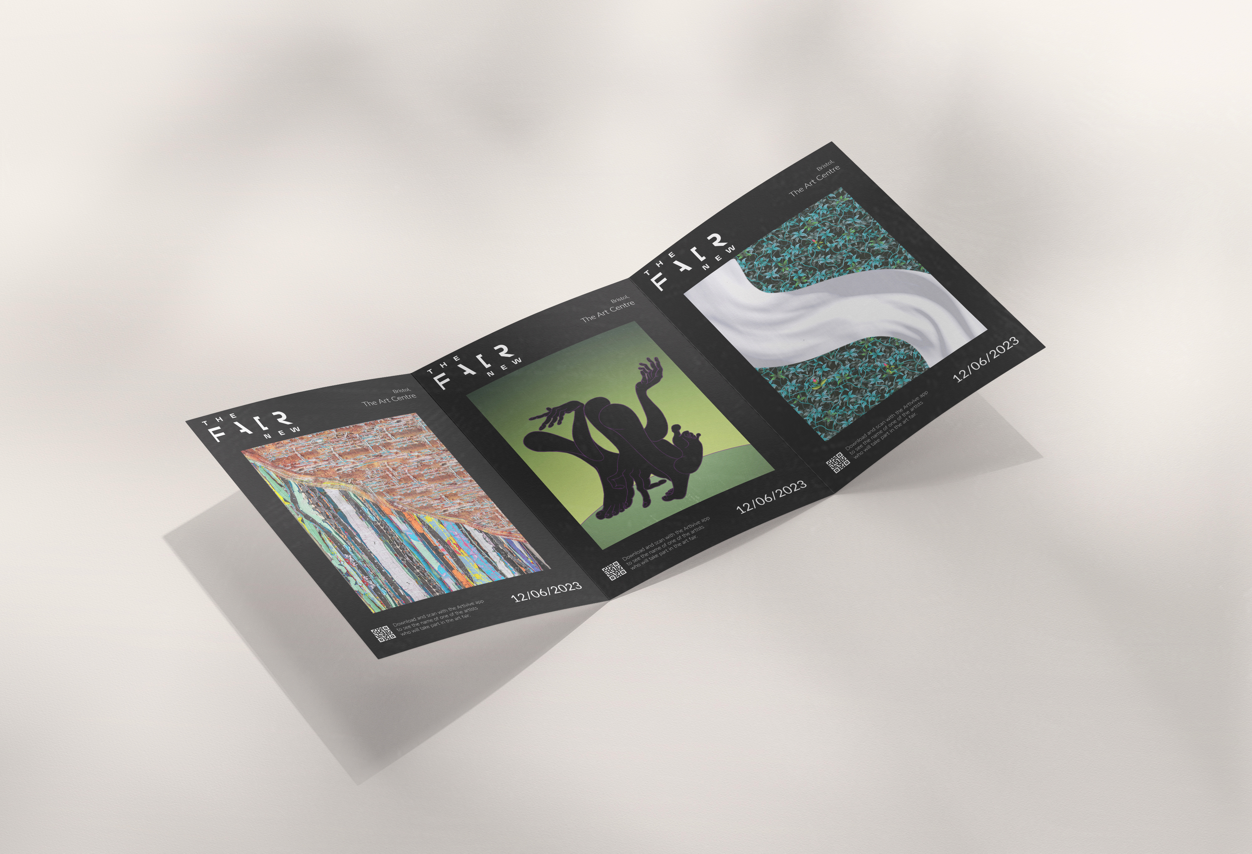
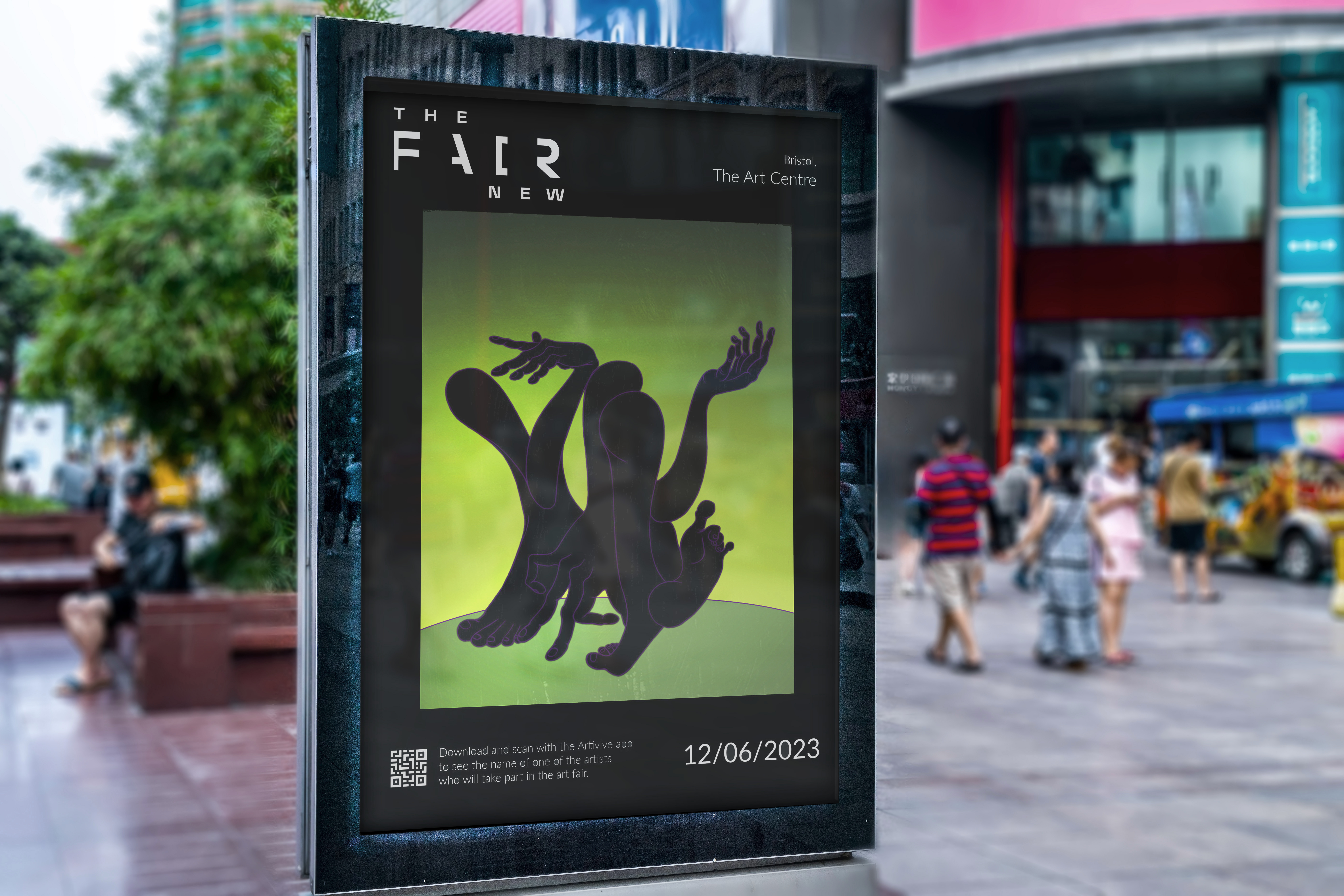
The Fair New has a promotional digital campaign which communicates its purpose and creates excitement around the event by revealing snippets of the featured artworks. It consists of motion posters suitable for different platforms with the names of the main artists' on the fair. They are inspired by their styles and unified through the blend of digital animation and textured overlays.
The Fair New has a promotional digital campaign which communicates its purpose and creates excitement around the event by revealing snippets of the featured artworks. It consists of motion posters suitable for different platforms with the names of the main artists' on the fair. They are inspired by their styles and unified through the blend of digital animation and textured overlays.
The Process
Typeface:
The
typography is in black and white sans-serif text, thus not distracting the
attention from the digital artworks. The typeface used for the logo is modified
version of Mohol- a typeface created after the Hungarian innovative artists
László Moholy-Nagy. It's boldness and straight angles are well complimented by
the roundness of Lato Thin.
![]()
![]()


Artists:
Animation Process:
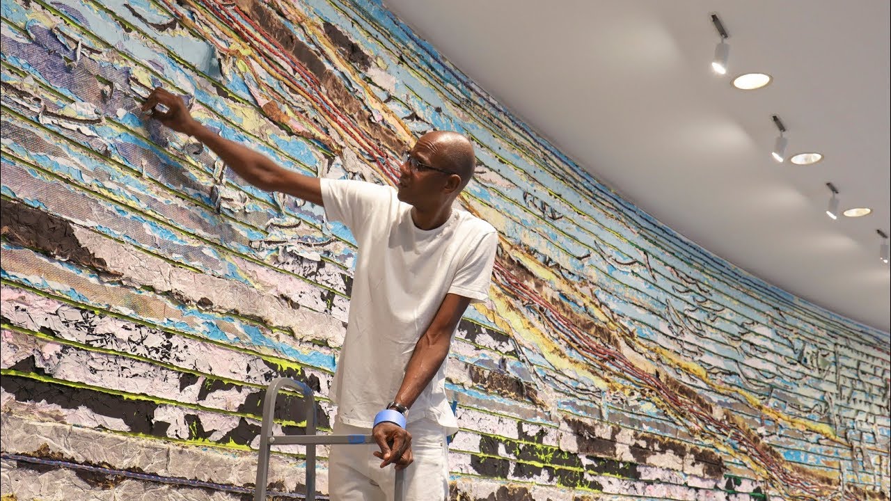
Mark Bradford
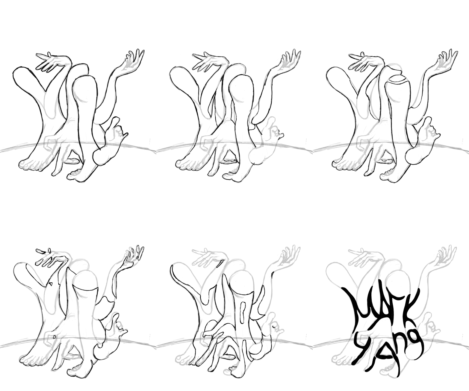
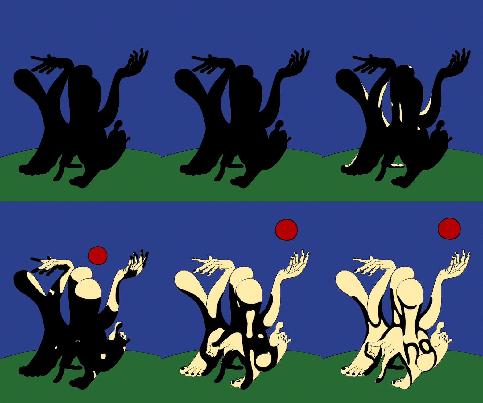
Mark Yang

Green Arctic
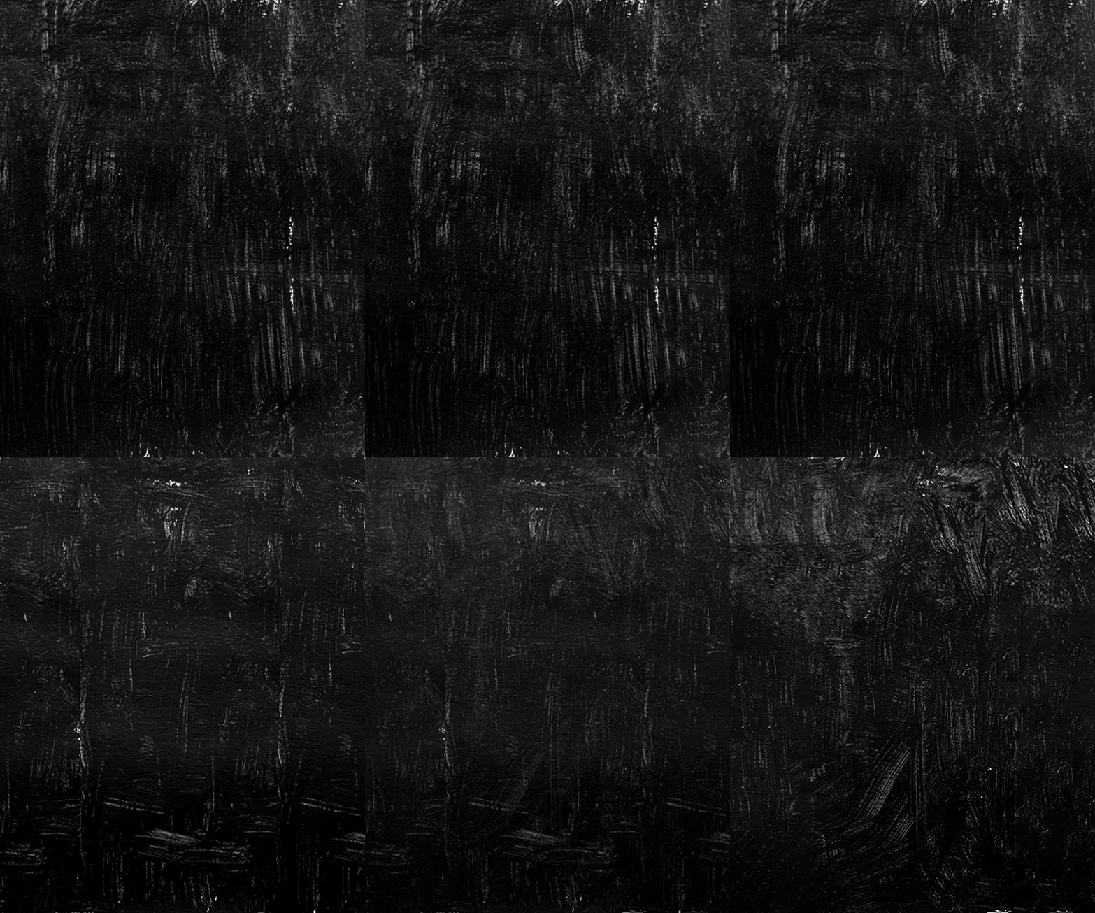
Acrylic paint on paper
Nedia Were

The Portrait of Kemunto
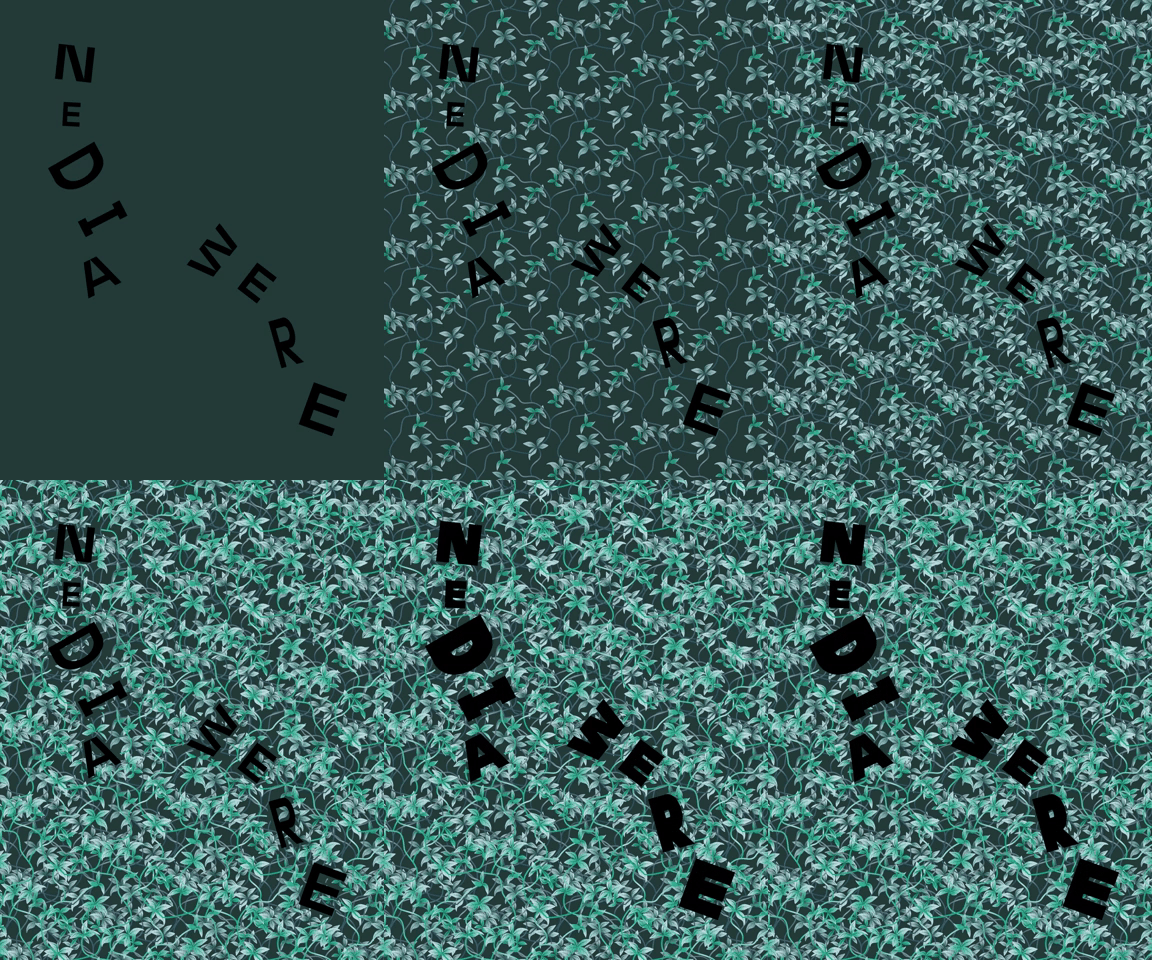
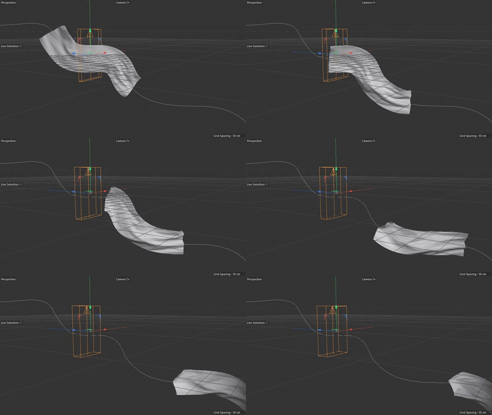
Nedia Were paints realistically and therefore I decided to make the falling sheet animation in Cinema 4D using the cloth modifier. I created the material for it by editing the previously used acrylic paint texture, thus making it look like a painted object and blend with illustrated background.
The Design Outcomes
